ILF Rebrand: 3 Designs Become One
RAFT Team, October 21, 2019
This is it—the final rebrand blog post before the new site goes live. Now you get to see the transformation of Indrani’s Light Foundation into RAFT.
After providing the team with 100 ideas, Rethink (the agency helping with our rebrand) stepped away with our feedback, worked for a few weeks, then returned to share three design ideas for RAFT. Here is a quick refresher on the scribbled ideas that lead to the final three designs:
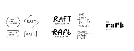
Rethink transformed each of these rough ideas into a complete design. In this post we will show an example of the logo, social media posts, and the mobile website for each of the designs. Then you can be the judge of which RAFT design is your favorite.
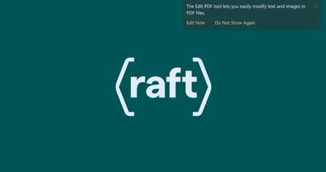
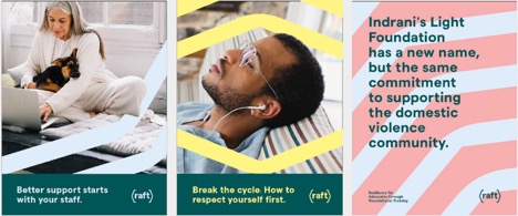
Choice 1: “The Brackets”
This was Jeremie’s favorite. The rest of the team liked this one, but ultimately, the vote on the brackets design was split right down the middle. Even when we reached out to family, friends, and advocates we had trained, the vote was 50/50 on this design.
Things the team loved:
- How the brackets framed RAFT and gave it a structure. Not quite a logo, but not quite a wordmark.
- We liked how the shape of the brackets transformed into patterns that could be used as backgrounds or woven into images (not big on the color choices, but liked the patterns)
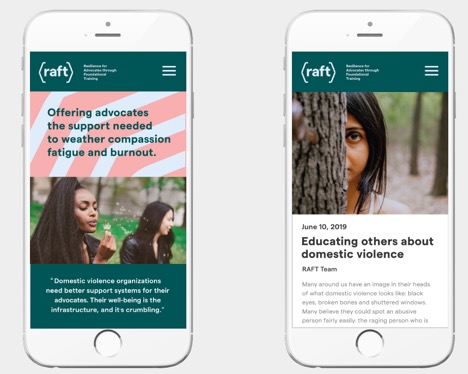
- The mobile site looked distinct with the pattern at the top, and clean with the different colors.
- We could imagine different design uses with the brackets in our blog posts, manual, and print materials
Choice 2: “The Support Beam”
This was Indrani’s favorite. This was also the other half of that 50/50 split amongst the team, friends, family, and advocates (SPOILER: There aren’t any votes left for design #3).
The team had mixed thoughts on this one:
- Loved the connection between the “A and F” that gives a feeling of support from the wordmark
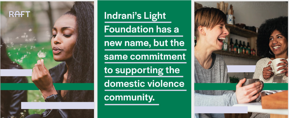
- We liked the pattern as background and in the images but felt these patterns were boring
- We were intrigued to underline things to show support, but it would take several days before we all got on board with the idea
- We like the meaning of RAFT being displayed beside the wordmark and felt it gave added clarity that we were missing with the original name and RAFT all on its own.
RAFT Logo
Social Media Post Examples
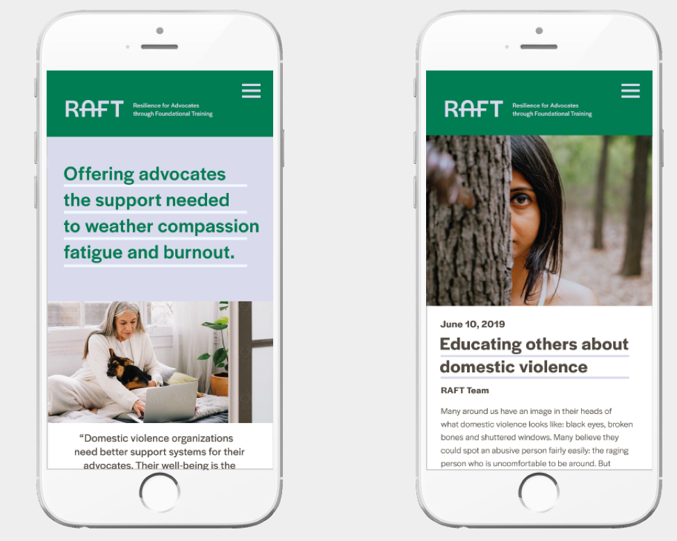
Mobile Website Example
Choice 3: “Designer Jeans”
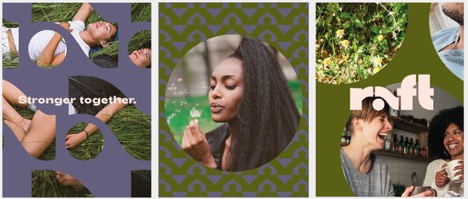
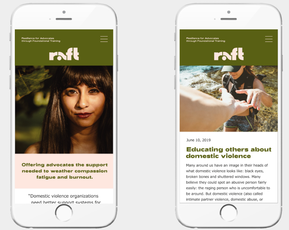
To be honest, before writing this post, I had forgotten the color palette of this choice (hopefully I will forget it again), my memories of this design focused on the design of the wordmark. This was the only design on which the team was 100% agreed. This design was a “NO.”
Why did this one miss the (word)mark?
- Ummm… the colors. Peach and olive green. Too many thoughts of sunny afternoons with the military lounging in sundresses for us.
- We felt the actual wordmark was too stylized, like a clothing company, and would be hard for people to read. We felt we could only read it because we already knew what it said.
- The patterns reminded us of wallpaper (although we liked the circles around the images)
- The mobile site with the hard to read wordmark and the odd color combo was just a big “NO”
Raft Logo
Social Media Post Examples
Mobile Website Examples
The Final Design is…
If you are reading this post on original ILF website, you can visithttp://raftcares.org/ now to see the splash page for the new site and get a hint at what our final decision was. We took elements from all three for the final design.
If you are reading this blog post on the new RAFT website, this final blog post is anti-climactic, as you have already seen the final decisions we made.
Either way, we hope you not only find the new RAFT design to your liking, but that you are getting value from the new design and all the new content available on the new RAFT website.
The team looks forward to being of even greater service as RAFT!
This is Part 8 of our rebrand story. Read previous articles about our rebrand below
Part 1 Rebranding ILF: A Story of Change
Part 2 Our Brand’s Highs and Lows
Part 3 A Solidified Brand Profile
Part 4 Playing in the Visual Sandbox
Part 5 Naming is HARD
Part 6 Getting Through the Bad Names
Part 7 99 Failures to 1 Great Idea


